


Why Headline Analyzers Are a Waste of Time
What's the real purpose behind these online free analyzers?

I've used headline analyzers to check my headline candidates and selected the highest-scoring ones for my stories.
These analyzers offer convincing-looking numbers, fancy graphics, and guidelines that make intuitive sense, like “user power words” or “keep it under 60 characters”.

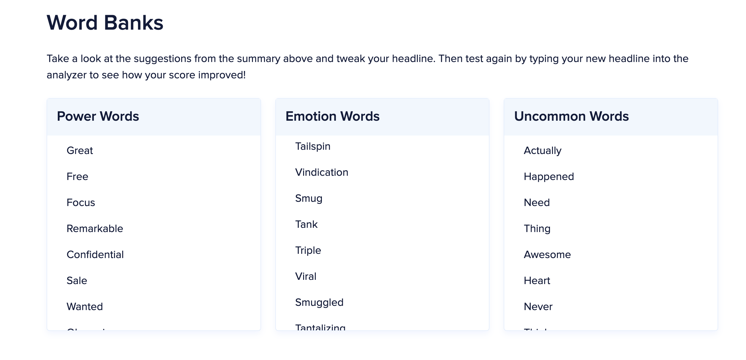
Some of these analyzers even provide you lists of “Power Words,” “Emotion Words” and “Uncommon Words” so that writers can “tweak and refine the headline based on suggestions until they find the best one for increased engagement.”
Given all these excellent marketing claims, a higher score from the analyzer should correlate with higher engagement.
Huge mistake. Please don't waste your time like I did.
I decided to test a headline analyzer using my database of 18,758 headlines from the top 30 Medium writers with known engagement metrics.
What I found changed my perspective on these analyzers.
Statistical testing method
I wanted to use the headlines with known engagement metric (number of claps), run the headlines through a headline analyzer to get the score, and run a statistical test using these two sets of numbers to find the truth.
The hypothesis
We will categorize the stories based on the Z-score of claps to examine whether the Analyzer Scores influence the average clap values.
To test the hypothesis, we will set up the null and alternative hypotheses as follows:
Null Hypothesis (H0): The mean values of claps are independent of the mean values of Analyzer scores across different Z-score groups.
Alternative Hypothesis (H1): The mean values of claps depend on the mean Analyzer scores across different Z-score groups.
Let’s review the data
In the graphs below, I have plotted two histograms.
The left one shows the number of claps on a logarithmic horizontal scale. I can see that most stories have less than 1,000 (10^3) claps.
On the right side, I have plotted log(claps) values on a histogram. I can see a roughly normal distribution, with a peak value below 7.
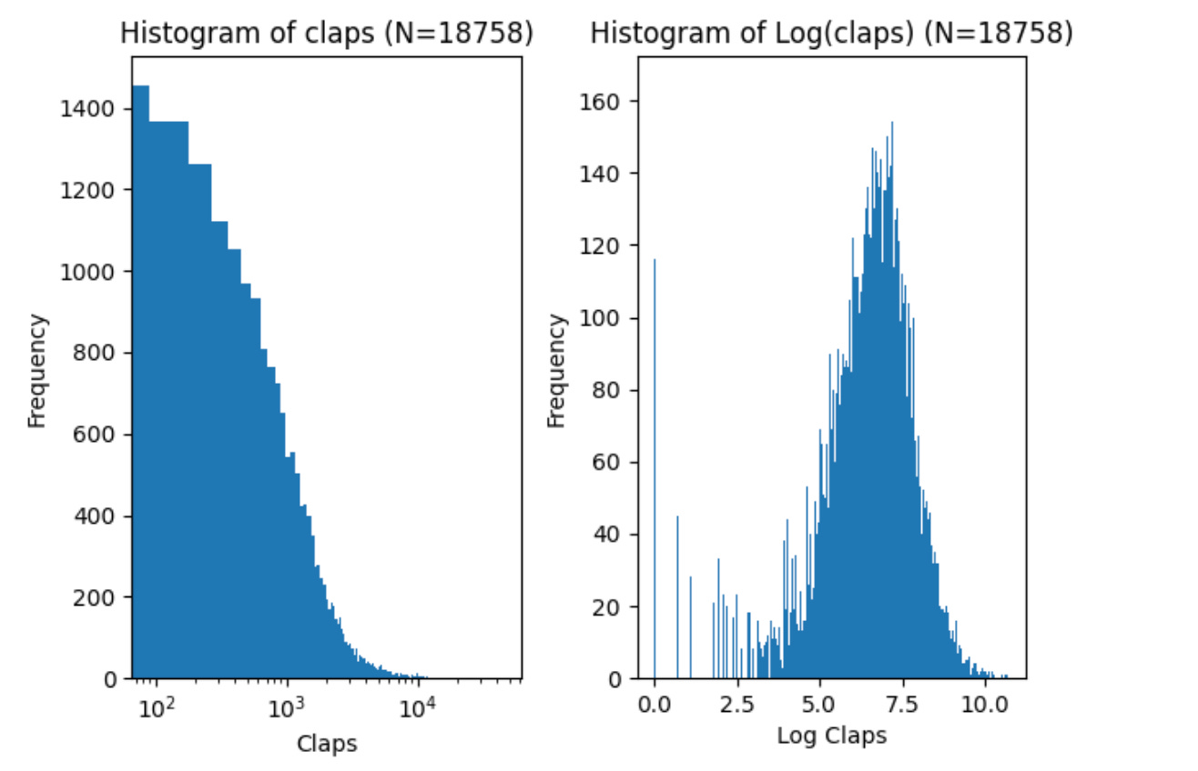
Let’s fit a normal (Gaussian) distribution using the log(claps) data. The mean value (mu) is 6.45, and the standard deviation (sigma) is 1.44 from the graph below.

I ran all the 18,758 headlines through the headline analyzer using a simple Python script and saved the analyzer scores. This process took several hours.
Let’s review the histogram of these analyzer score values. The graph below shows scores between 23 and 93. The histogram shows two peaks, around 52 and 67 score values.
Once again, I used the Analyzer score data to fit the normal (Gaussian) distribution. The mean value (mu) is 62.97, and the standard deviation (sigma) is 14.58.

Next, we organize the data into buckets based on each story's log(claps) value.
We calculate the Z-score by finding the difference between a data point and the dataset's average. Then, we divide that difference by the standard deviation to see how many standard deviations the data point is from the mean.
Here is the formula:
Where
Z = standard Z-score
x = observed value (claps)
\mu = mean of the sample
\sigma = standard deviation of the sample
We can count the stories in each bucket by rounding the Z-score to the closest integer value.
The title column below shows how the 18,758 headlines are distributed—for example, 30 stories with a Z-score of 3.0, so three standard deviations from the mean value.

Perform the test
Let’s group the claps and Analyzer Score mean values in the same buckets by the Z-score.
From the table below, we can already see the big problem.
The Analyzer score is surprisingly close to the mean value of 62.97, regardless of how many claps the particular story has received.

We can calculate the Pearson correlation coefficient and the P-value to determine if there is any statistical significance between mean claps and the mean analyzer scores.
Here are the results based on the numbers above.
Pearson correlation coefficient: 0.612
P-value: 0.107
There is no significant relationship between mean claps and mean scores.
So, the Alternative Hypothesis (H1), “The mean values of claps depend on the mean Analyzer scores across different Z-score groups,” is FALSE.
I created a scatter plot with the Analyzer Score on the vertical axis and the Claps on the logarithmic horizontal axis. To make different groups more visible, I color-coded the claps by Z-score. On the left, the blue dots indicate fewer than four claps; on the right, the grey dots indicate more than 24,000 claps. Each color shows the stories with the respective standard deviation around the mean value.
If the Analyzer Score correlates with engagement (claps), we should see high score values (over 80) only in the top right corner and low score values (less than 30) in the bottom left corner.
However, the Analyzer Scores are distributed randomly across all clap values. This scatter plot visually confirms the Pearson correlation calculation above.

The "shocking" results
At this point, I had spent many evenings during the week trying to prove myself wrong because I firmly believed that these headline analyzers worked as advertised.
I plotted correlations, ran through different ANOVA and Kruskal-Wallis tests, and looked into other data that the headline analyzer provided, such as
commonWordPercentage
powerWordPercentage
emotionalWordPercentage
sentiment
length in characters
word count
I tweaked the numbers to show weak correlations between claps and other data, such as the word count and the number of characters in the title. I studied the original 18,758 stories dataset I had extracted from Medium to understand if I was missing something fundamental.
I ditched the analyzer and tried random numbers as scores.
Guess what? The random numbers outperformed the analyzer with a slightly stronger correlation!
Yep, you’d be better off rolling dice than wasting time on this headline analyzer.
After all this testing, I was convinced that the Analyzer score has nothing to do with story success and engagement. These marketing slogans are misleading.

What is the real purpose of these free headline analyzers?
So why would web developers go through this effort to build this kind of headline analyzer that spits out random numbers?
I did a bit of research and found out that the “headline analyzer” search term surfaced around 2013 and the interest has grown significantly worldwide ever since.

It sure looks to me that the “headline analyzer” is just a clever marketing ploy to drive traffic to the site with minimal costs. Building a beautiful infographics page with random number generator shouldn’t take longer than one day.
I’m pretty sure that a small fraction of users will convert to paying customers, or the website owner will monetize the traffic through advertising or affiliate links.
That is why you can find so many of these free headline analyzers.
You are the product, and they were created to monetize your attention.

Conclusion
Headlines are essential, and you must create a title that will draw readers’ attention to your story if you want any engagement.
These free headline analyzers were created to monetize your attention. You may find some useful “power words” or “emotional words”, but don’t trust the score.
You are better off throwing a dice or using a random number generator to see a number.

thank you, Finn. I knew there was something else behind all of this and honestly, some of the ones that I've used based on what other publications have said I've had the worst click rates.
So I do my own thing now. I do ask about SEO optimization etc. I was speaking with someone about my titles and I said well I can't make them too long because of this and that things I have been told before and they said that is not true I mean, obviously there's common sense, but since I started changing my titles and doing it according to formulas of curiosity and the other things that some people teach, I'm getting a lot more clicks.
One more tab, I can close on my iPad and computer 🎉
Another informative article Finn. I haven't used them since I tried and wasn't overly thrilled with results.